Toronto Neighbourhoods Through 103 Public Indicators
An exploratory analysis of Toronto neighbourhood data
View the Project on GitHub epheva/toronto-neighbourhood-correlations
Toronto Neighbourhoods Through 103 Public Indicators
An exploratory analysis of how Toronto neighbourhood characteristics move together and what kinds of neighbourhood profiles emerge
Toronto publishes an enormous amount of neighbourhood level data. Demographics, housing, health, public safety, infrastructure, transportation, civic indicators and municipal assets are often available separately, but it is much harder to see how those pieces fit together.
For this project, I combined dozens of public datasets into a single neighbourhood level table and used it to ask three broad questions:
- What characteristics are associated with selected outcomes such as voter turnout?
- Which neighbourhood characteristics tend to move together?
- If I ignore the neighbourhood names and look only at the data, do groups of neighbourhoods with broadly similar profiles emerge?
The final dataset contains 140 historical Toronto neighbourhoods and 103 numeric indicators. Importantly, the goal is exploratory rather than causal. The analysis is meant to reveal patterns worth investigating, not to rank neighbourhoods, claim that one characteristic causes another, or suggest that every resident resembles the average of the neighbourhood where they live.
I provide the preprocessed, cleaned full dataset with all variables linked to individual neighbourhoods, as well as provide the complete analysis code at the end of this article.
Public data sources:
- City of Toronto Open Data Portal (https://open.toronto.ca/)
- Canada Mortgage and Housing Corporation (https://www03.cmhc-schl.gc.ca/hmip-pimh/#Profile/1/1/Canada)
- Ontario Community Health Profiles Partnership (https://www.ontariohealthprofiles.ca/dataTablesON.php?varTab=HPDtbl&select1=7)
Why I used Toronto’s historical 140 neighbourhood geography
Toronto used 140 social planning neighbourhoods until 2022, when 16 high growth neighbourhoods were split to create the current 158 neighbourhood system. I use the historical 140 neighbourhood geography because many of the datasets in this project are available at that level. This improves comparability across sources, but means the analysis should be interpreted as a synthesis of neighbourhood patterns across different periods rather than a precise snapshot of Toronto today.
Methodology
My first goal was to understand what patterns are associated with neighbourhood voting behaviour, operationalized as voter turnout.
The voter turnout data are organized by ward and voting subdivision. A voting subdivision is a small geographic area used to administer an election. A voter’s residential address determines their ward and subdivision, which is then associated with an assigned voting place. Because subdivision numbers repeat across wards, the combination of ward and subdivision forms a composite key that uniquely identifies each geographic voting subdivision. We therefore need a method to assign neighbourhoods based on this composite key.
Importantly, we can’t use the voting subdivisions by themselves since the majority of public datasets are at the neighbourhood level.
1. Project the geographic layers into metres
The voting subdivision polygons, historical neighbourhood polygons and ward polygons are loaded with GeoPandas and projected to EPSG:26917.
This matters because the next step involves calculating areas. Latitude/longitude coordinates are not suitable for interpreting polygon areas directly in square metres; the projected coordinate system allows the geographic overlap calculations to be performed in metre-based units.
2. Assign each voting subdivision to a neighbourhood
Voting subdivisions do not line up perfectly with neighbourhood boundaries. A single subdivision can therefore overlap more than one neighbourhood.
The code intersects the voting subdivision polygons with the historical neighbourhood polygons and calculates the physical area of every overlap. Each voting subdivision is then assigned to the neighbourhood containing the largest share of its area.
In plain language, if most of a voting subdivision lies in Neighbourhood A but a smaller part falls inside Neighbourhood B, the entire subdivision is assigned to Neighbourhood A.
This is simple, but it introduces some geographic approximation around boundaries as one limitation.
3. Aggregate turnout
Across all voting subdivisions within a neighbourhood, I sum the number of people who voted and the number of eligible electors.
Neighbourhood voter turnout is then calculated as: Turnout = total number voted / total eligible electors.
This new dataset is then joined with all of our variables to create a master file (see next section).
4. Building the variable dataset
The preprocessing notebook prepares and merges 69 predictor tables in addition to the voter turnout table.
The source material spans a wide range of topics, including:
- population and household composition
- immigration and citizenship
- income, employment and social assistance
- housing and rents
- health conditions and health-care use
- public safety and police activity
- environmental pollution
- transportation
- schools and child care
- social and affordable housing
- parks and recreation
- public art and cultural amenities
- municipal infrastructure
- public-space amenities
- vehicles and collisions
- other neighbourhood services and assets
Different types of source data required different preprocessing strategies.
Neighbourhood level datasets
When a source already includes a neighbourhood identifier, I map or aggregate it to the historical 140 neighbourhood geography.
When multiple current neighbourhoods map to one historical neighbourhood, total population is summed. Other selected neighbourhood profile measures are averaged across the component neighbourhoods. This is an approximation for rates and proportions.
Point-location datasets
Several datasets begin as individual locations rather than neighbourhood level summaries. For example, individual fire hydrants, drinking fountains, schools, benches, tennis courts, public art and other municipal assets.
These records are converted to geographic points and spatially joined to the historical neighbourhood polygons. I then count the number of records falling inside each neighbourhood.
5. Converting raw counts into population normalized measures
Raw counts are often difficult to compare across neighbourhoods because neighbourhoods have different populations.
A neighbourhood with more residents would generally be expected to have more events, facilities and service users.
For many variables I therefore convert raw counts into population normalized measures. For example: Crime rate = Crime total count / total population × 100
The same general approach is used for measures such as police calls, shootings/firearm discharges, social-housing units, social-assistance recipients, rent-bank applicants and many municipal assets.
6. The final analytic table
After preprocessing, the analysis uses 103 numeric indicators across 140 historical neighbourhoods.
The variables are measured in very different units. Some are dollars, some are proportions, some are rates, and some are counts normalized by population. In some analyses, such as the approach to clustering neighbourhoods together (see later section), every variable is standardized into a z-score.
A z-score tells us how far a value is from the mean in standard deviation units:
0= approximately the average neighbourhood;+1= one standard deviation above the neighbourhood average;-1= one standard deviation below it.
This puts all 103 variables onto a common scale.
Results
The correlation matrix
The first analysis calculates the pairwise Pearson correlation between every pair of numeric indicators.
Pearson’s r ranges from -1 to +1:
- values near +1 mean that two variables tend to be high in the same neighbourhoods
- values near -1 mean that neighbourhoods high on one variable tend to be low on the other, and
- values near 0 indicate little linear relationship.
False discovery rate correction
For one selected variable such as voter turnout within each neighbourhood, its individual Pearson correlation is calculated with every other indicator.
I then apply the false discovery rate (FDR) correction and only display relationships surviving q < .05.
Why do this? When many statistical tests such as a correlation are performed at once, some will look significant simply by chance. FDR correction reduces that multiple testing problem while remaining less conservative than procedures designed to eliminate virtually every possible false positive (such as Bonferroni correction).
Even with FDR correction, these are still descriptive neighbourhood-level associations. They are not causal effects.
Part 1: Voter turnout case study
After the above procedure, the voter turnout correlations shows that voting participation is embedded in a much broader neighbourhood demographic and socioeconomic structure.
Higher voter turnout neighbourhoods tend to have higher non-immigrant shares, higher Canadian citizenship rates, higher English/French mother-tongue shares and stronger socioeconomic or preventive-care indicators. Lower-turnout neighbourhoods tend to show the opposite pattern, including higher immigrant/newcomer concentration, unemployment and long-commute measures.
One could interpret this result as that of neighbourhoods with more immigrants tend also to vote less often.
Importantly, this is an ecological analysis. The unit of observation is the neighbourhood, not the individual resident. A correlation between neighbourhood immigrant share and neighbourhood voter turnout does not tell us whether a particular immigrant resident voted, whether that person was eligible to vote, or why the neighbourhood-level association exists.
Citizenship eligibility, age, income, housing, mobility, length of residence, language and many other factors overlap geographically. The appropriate interpretation is therefore that voter turnout forms part of a larger neighbourhood pattern and not that one demographic characteristic independently determines voting behaviour.
Notably, each variable can also be linked to the dataset that was used to generate that variable. Each variable ends with _df[number] and that df number can be linked to the MasterList data dictionary (see last section). Unfortunately understanding what each variable means exactly is a bit of a manual process, but I tried to make the variable name as descriptive as possible.
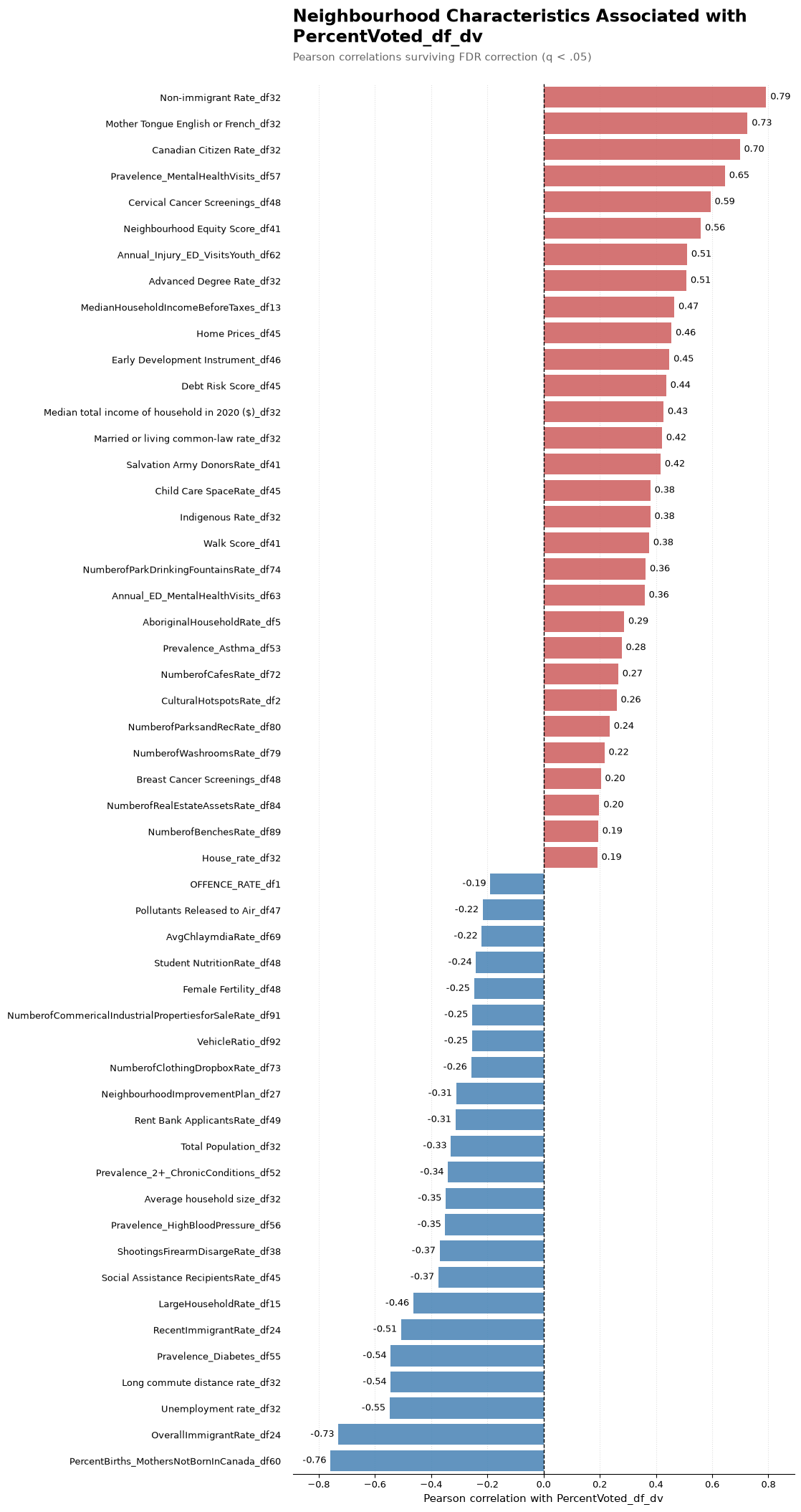
Figure 1. Each bar shows the Pearson correlation between 2022 neighbourhood voter turnout and another neighbourhood indicator. Bars extending in the positive direction represent characteristics that tend to be higher in neighbourhoods with higher voter turnout, while bars extending in the negative direction represent characteristics that tend to be higher in lower turnout neighbourhoods. Longer bars indicate stronger relationships. Only correlations that remain statistically significant after false discovery rate correction (q < .05) are displayed.
Part 2: Recorded chlamydia rate case study
One perhaps interesting variable in the dataset is the recorded chlamydia rate, which can be used as an index of the rate of sexually transmitted disease within a neighbourhood.
Applying this correlation approach, the recorded chlamydia rate also sits within a larger neighbourhood pattern.
Higher recorded chlamydia rates tend to co-occur with several measures of high police activity, high crime rate, high social assistance and social housing, and acute or high mental-health service use, while chlamydia tend to be lower in neighbourhoods with higher married/common-law shares, more house-based residential structure and higher vehicle availability.
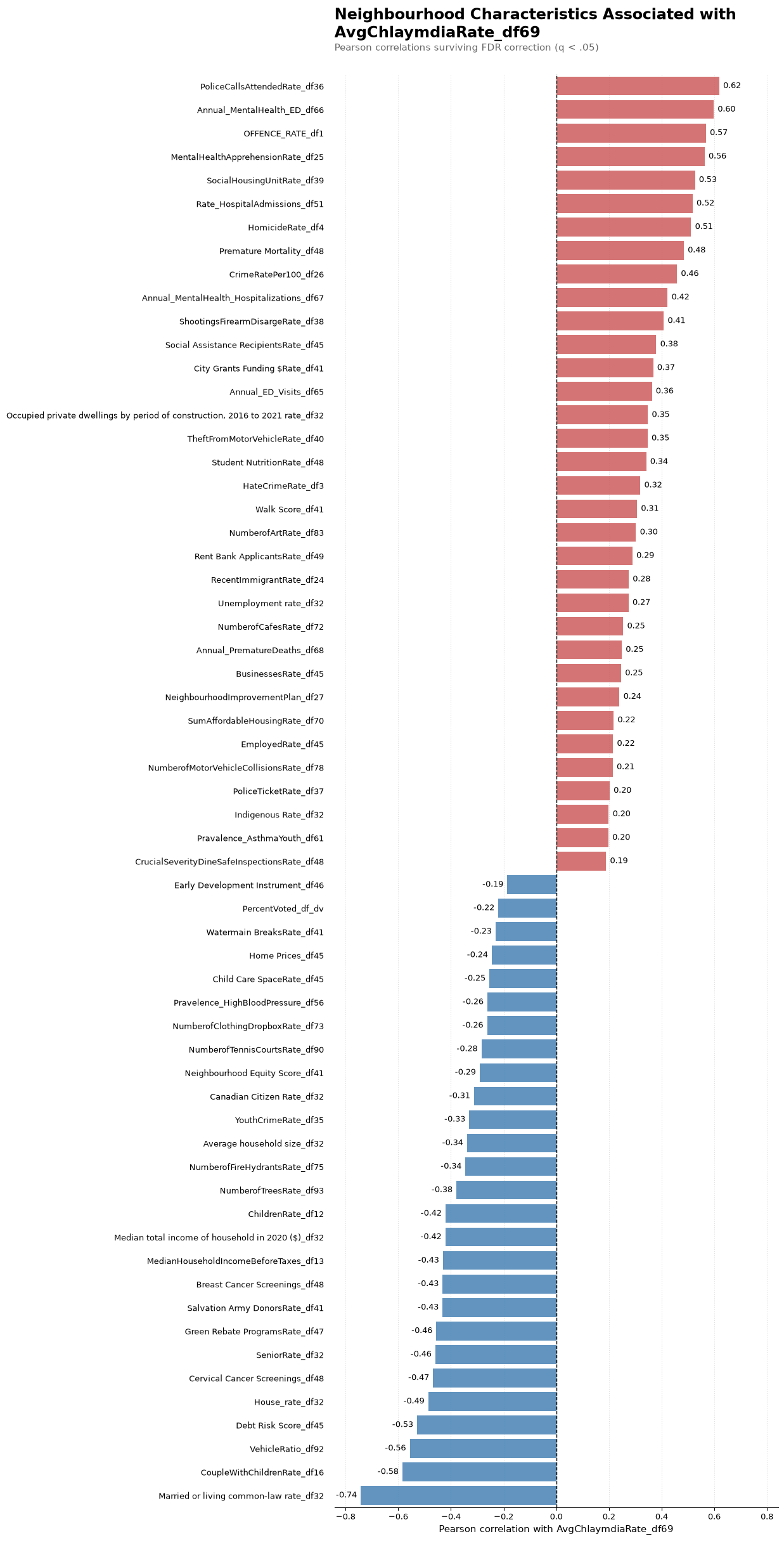
Figure 2. Each bar shows the Pearson correlation between a neighbourhood’s recorded chlamydia rate and another indicator. Positive correlations indicate characteristics that tend to be higher in neighbourhoods with higher recorded chlamydia rates, while negative correlations indicate characteristics that tend to be higher where recorded rates are lower. The length of each bar represents the strength of the relationship, and only correlations surviving false discovery rate correction (q < .05) are shown.
Part 3: Social assistance recipients case study
The social assistance measure also shows a strong neighbourhood socioeconomic gradient.
Higher social assistance use tends to appear alongside unemployment, Neighbourhood Improvement Area designation, rent bank use, long commuting, several public safety indicators and other measures of socioeconomic stress.
It tends to move in the opposite direction from neighbourhood equity, income, home prices, advanced education and preventive care screening measures.
The important result is not that one of these variables causes another. Rather, multiple dimensions of socioeconomic and health vulnerability frequently co-locate geographically.
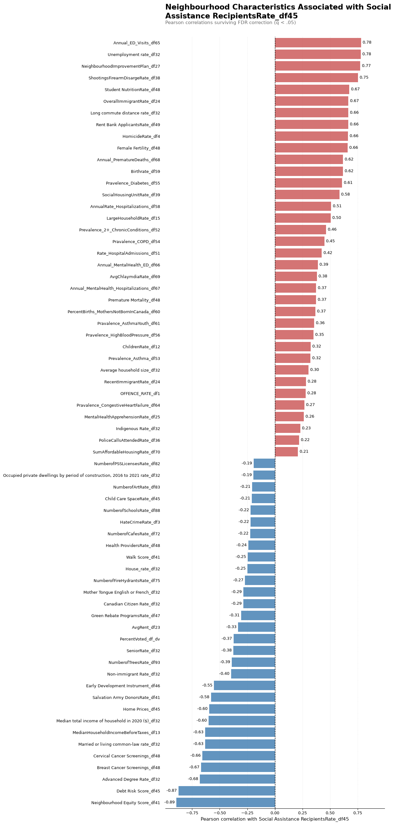
Figure 3. Each bar shows the Pearson correlation between neighbourhood social assistance use and another indicator. Positive bars identify characteristics that tend to be higher in neighbourhoods with greater social assistance use, while negative bars identify characteristics that tend to be higher where social-assistance use is lower. Longer bars represent stronger correlations, and only relationships surviving false discovery rate correction (q < .05) are displayed.
Summary of case studies
These case studies reveal that voting behaviour, recorded chlamydia rates, and social assistance recipients correlates with many neighbourhood-level indicators.
One interpretation may be that social assistance recipients face many difficulties in Toronto. Neighbourhoods with higher rates of social assistance also tend to have higher unemployment and crime rates, as well as greater health burdens.
Part 4: What moves together across Toronto neighbourhoods?
Complete neighbourhood-level correlation heatmap
As a reminder, the correlation matrix approach described above calculates the correlation between two variables, like voter turnout and Canadian citizenship rate.
We can obtain a full matrix containing thousands of pairwise comparisons between all variables in our dataest. This allows us to create an exploratory map of the structure of the dataset rather than as thousands of separate hypothesis tests.
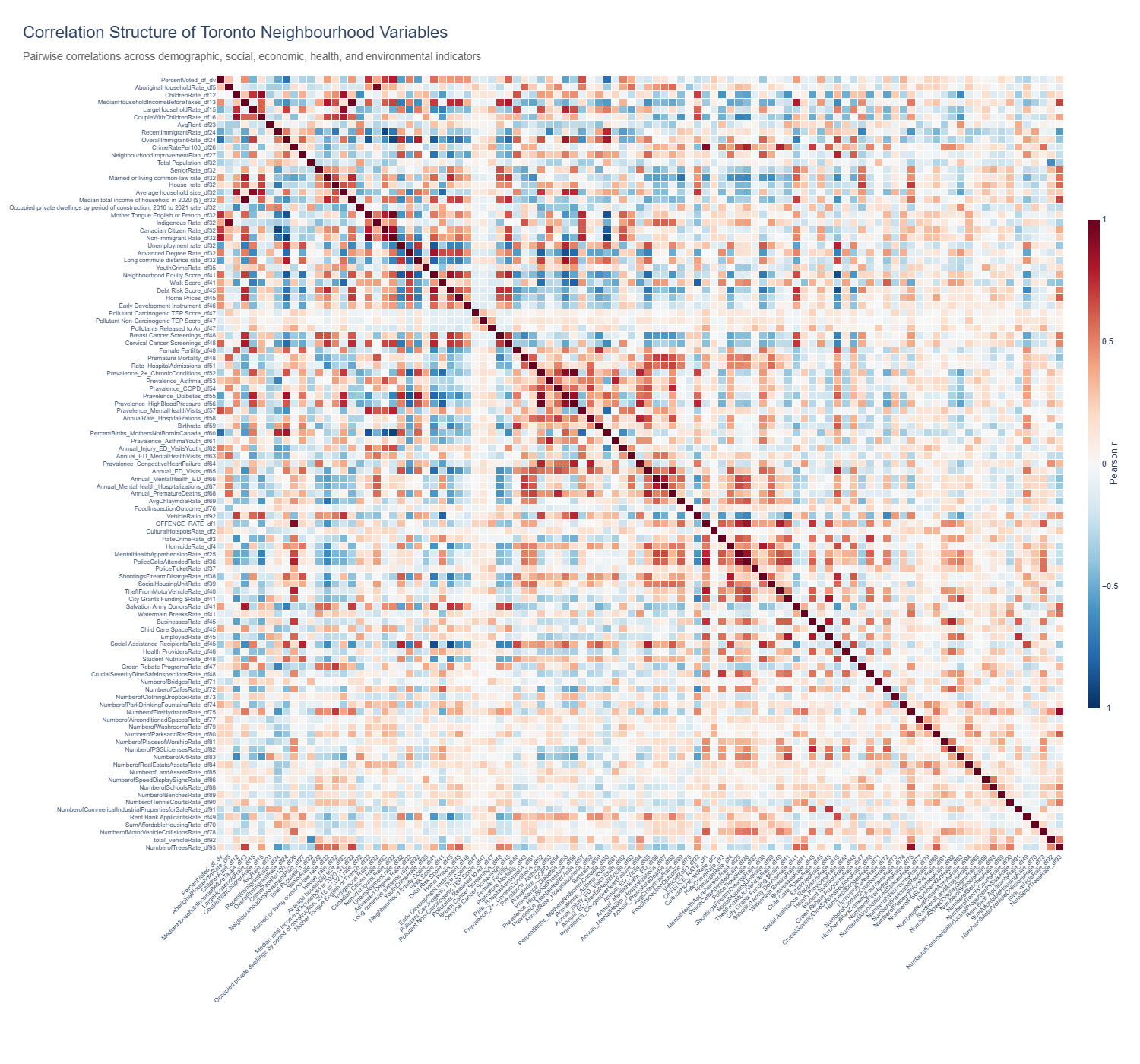
Figure 4. This correlation similarity matrix heatmap shows the Pearson correlation between every pair of the 103 neighbourhood indicators. Each square represents one pair of variables: the colour indicates whether the relationship is positive or negative, while stronger colours indicate correlations farther from zero. The diagonal represents each variable correlated with itself (r = 1). Large blocks of similar colour indicate groups of characteristics that tend to show similar or opposing geographic patterns across Toronto. The interactive version can be hovered over to see the two variables, Pearson correlation (r), and raw p-value for each cell.
See this link for the full heatmap of this full correlation matrix: https://toronto-neighbourhood-correlations-c5but5exhsfgyapafdyctq.streamlit.app/
The heatmap is interactive: hovering over a cell shows the two variables, their Pearson correlation and the raw p-value.
Part 5: Grouping the variables themselves
Next, what if we want to understand which variables then to group, or cluster, together. That is, can we find groups of variables that are highly related to each other and can be described by a common theme.
Hierarchical clustering of variables
This analysis converts the correlation matrix described previously into a distance matrix: Correlation distance = 1 − Pearson r
This gives an intuitive scale:
- two perfectly positively correlated variables (
r = 1) have distance0; - two uncorrelated variables (
r = 0) have distance1; and - two perfectly negatively correlated variables (
r = -1) have distance2.
The resulting distances are clustered using average-linkage hierarchical clustering.
A dendrogram then shows how individual indicators progressively merge into larger groups. Cutting the dendrogram at a correlation distance of 0.70 produces 17 variable clusters.
The cutoff should not be interpreted as saying that every pair of variables inside one cluster has the same correlation. With average linkage, clusters are merged based on the average distance between their members.
Notably, some groups contain only one variable. This simply means that, at the chosen 0.70 distance cutoff, that indicator was not similar enough to another variable or cluster to merge with it.
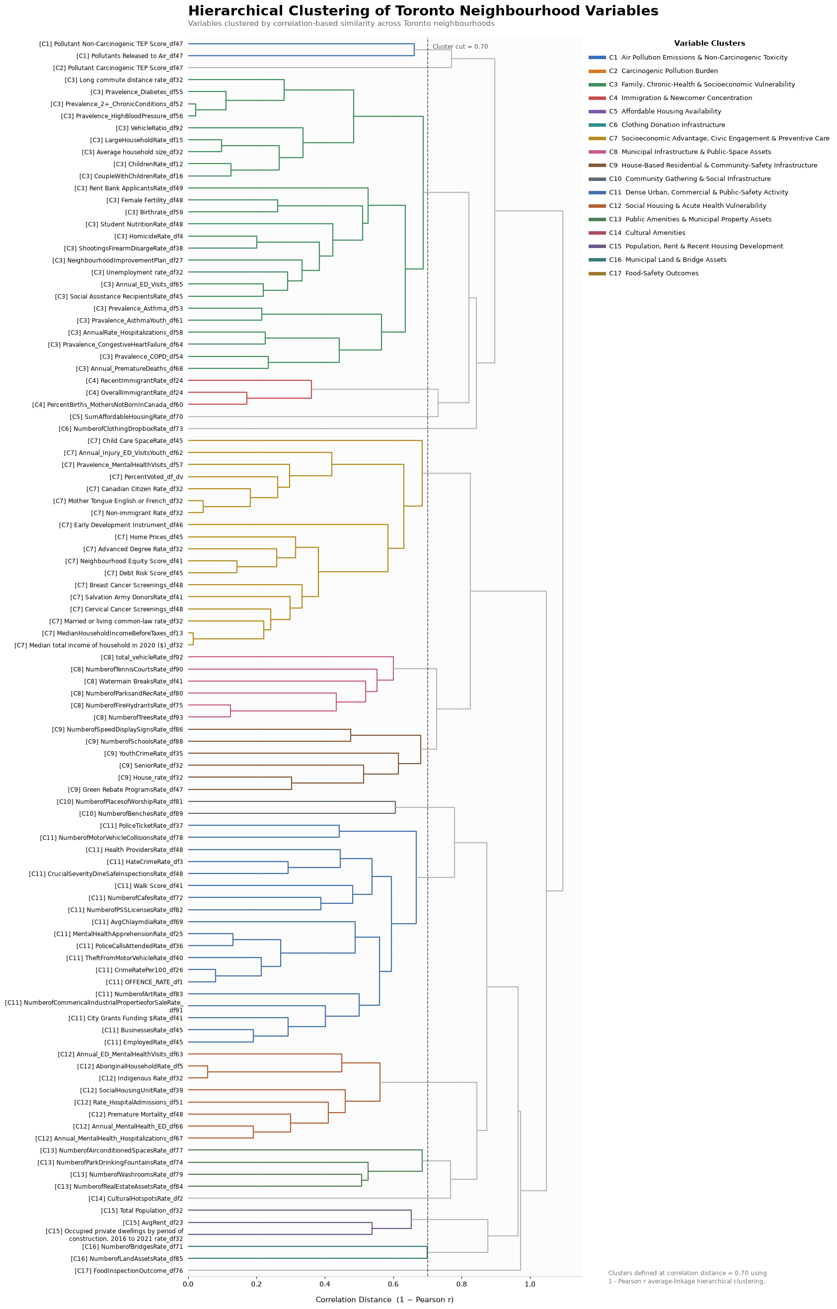
Figure 5. This dendrogram groups the 103 indicators according to how similarly they vary across Toronto neighbourhoods. Each label on the left represents one variable, and branches show how variables or groups of variables progressively merge. Variables that join at a lower correlation distance (x-axis) have more similar neighbourhood patterns. Variables that merge higher up are less similar. The horizontal cut at a correlation distance of 0.70 divides the tree into the 17 variable clusters discussed below. The coloured branches help show which variables belong to the same resulting group. The legend on the right describes cluster themes.
The 17 variable themes
I assigned short descriptive names after inspecting the variables belonging to each statistical cluster. More specifically, I used ChatGPT to provide a label for variables that tend to cluster together.
| Cluster | Descriptive theme |
|---|---|
| C1 | Air Pollution Emissions & Non-Carcinogenic Toxicity |
| C2 | Carcinogenic Pollution Burden |
| C3 | Family, Chronic-Health & Socioeconomic Vulnerability |
| C4 | Immigration & Newcomer Concentration |
| C5 | Affordable Housing Availability |
| C6 | Clothing Donation Infrastructure |
| C7 | Socioeconomic Advantage, Civic Engagement & Preventive Care |
| C8 | Municipal Infrastructure & Public-Space Assets |
| C9 | House-Based Residential & Community-Safety Infrastructure |
| C10 | Community Gathering & Social Infrastructure |
| C11 | Dense Urban, Commercial & Public-Safety Activity |
| C12 | Social Housing & Acute Health Vulnerability |
| C13 | Public Amenities & Municipal Property Assets |
| C14 | Cultural Amenities |
| C15 | Population, Rent & Recent Housing Development |
| C16 | Municipal Land & Bridge Assets |
| C17 | Food-Safety Outcomes |
Several of the larger groups are especially informative.
[C3] Family, chronic health and socioeconomic vulnerability
Cluster C3 contains indicators related to larger households and children alongside fertility, unemployment, social assistance, rent-bank use, Neighbourhood Improvement Area designation, long commutes, several chronic health conditions, hospitalization measures, and some serious public safety outcomes.
This does not mean that family structure itself represents vulnerability. Rather, these variables display sufficiently similar geographic patterns that they are grouped together statistically. These are neighbourhoods where larger families with more children tend to coincide with greater economic hardship, worse chronic health, longer commutes, and more social service or public safety challenges.
[C7] Socioeconomic advantage, civic engagement and preventive care
C7 combines variables including income, home prices, advanced education, citizenship, non-immigrant share, neighbourhood equity, voter turnout, cancer screening measures and several related indicators.
More specifically, the cluster suggests that neighbourhoods with higher incomes, more expensive homes, more advanced education, higher equity scores and higher voter turnout also tend to have higher cancer-screening rates and a larger share of residents who are Canadian citizens and non-immigrants.
[C11] Dense urban, commercial and public-safety activity
C11 contains a large set of measures including businesses, employment, cafes, commercial properties, public art, Walk Score, police calls, offences, motor vehicle collisions, inspections and health providers.
In other words, neighbourhoods with more businesses, cafes, jobs, commercial properties, public art and health providers also tend to have more police calls, offences, collisions and inspections.
The main interpretation may be urban intensity. These areas likely have many people working in, visiting and moving through them, so high public safety or service activity does not necessarily mean residents themselves are driving those patterns.
[12] Social housing and acute-health vulnerability
C12 combines social-housing concentration with hospital and emergency/mental health utilization, premature mortality and related measures.
More specifically, the cluster links more social housing with higher hospital admissions, emergency and mental health service use, and higher premature mortality.
A note on the cluster names
The hierarchical clustering algorithm returns cluster membership numbers, not names.
I used ChatGPT to help summarize the variable lists into concise descriptive themes, then reviewed and revised those labels against the actual variables.
Someone else could reasonably choose different wording for the same clusters. The statistical result is the membership while the descriptive name used in this article is interpretation.
Part 6: Grouping the neighbourhoods
This final analysis reverses the question. Instead of grouping variables according to how similarly they behave across Toronto, I group neighbourhoods according to how similar their overall 103 variable profiles are.
In other words, neighbourhoods that end up in the same cluster would share a similar overall pattern across many social, economic, health, demographic, and urban characteristics. For example, one cluster might contain neighbourhoods that tend to have higher incomes, higher home prices, and better preventive health indicators, while another might contain neighbourhoods with more social housing and higher health service use.
The hierarchical clustering described in the previous section asks which variables tend to behave similarly across Toronto. This neighbourhood clustering analysis asks which neighbourhoods have similar overall profiles across all of the variables in our dataset.
What K-means does
The approach I take is an unsupervised clustering algorithm called K-means.
K-means represents each neighbourhood as a point in a 103 dimensional space, with one dimension for each standardized indicator. This is unsupervised, meaning the algorithim chooses the neighbourhood groupings.
The algorithm repeatedly:
- assigns each neighbourhood to the nearest cluster centre,
- recalculates the centre of each cluster, and
- repeats the process until the assignments stabilize.
Missing-value handling
Neighbourhoods occasionally have missing observations for individual indicators.
Before K-means, missing values are filled using median imputation. For each variable, a missing value is replaced by the median observed across neighbourhoods.
This allows all neighbourhoods to remain in the clustering analysis and is relatively resistant to extreme values.
The drawback is that imputation makes a missing observation look relatively average. Variables with substantial missingness could therefore contribute less meaningful information than variables observed everywhere.
Standardization
After imputation, every variable is standardized, which is essential for K-means.
Without standardization, a variable measured in dollars could dominate a variable expressed as a proportion simply because the dollar values are numerically much larger.
After standardization, every variable is represented in standard-deviation units.
Part 7. Choosing eight neighbourhood clusters
I compared candidate K-means solutions using the silhouette score.
The silhouette score measures how well each neighbourhood fits within its assigned cluster compared with the nearest alternative cluster. Higher values indicate clearer separation.
The feature set does not imply that Toronto consists of a small number of perfectly isolated natural categories. Instead, the algorithim tries to group different neighbourhoods together into a set number of clusters that is defined based on inspection of the silhouette score.
The highest silhouette score occurs at k = 3, but this produces very broad groups that collapse several substantively different neighbourhood patterns together. I therefore use eight clusters as a descriptive compromise. Its silhouette score remains within the same relatively low range, while the additional clusters produce substantially more interpretable neighbourhood profiles. Eight should therefore be viewed as a presentation and exploratory choice, not the statistically optimal or uniquely correct number of clusters.
Part 8. The eight neighbourhood profiles
To understand each K-means cluster, I calculate the mean standardized value of every variable among the neighbourhoods belonging to that cluster.
I then rank indicators by the absolute magnitude of that cluster mean and display the ten largest deviations.
For example, if a cluster is +1.5 SD on household income, the average neighbourhood in that cluster is 1.5 standard deviations above the citywide neighbourhood mean on that indicator. A negative value means that the cluster falls below the citywide neighbourhood average.
The cluster labels below summarize those strongest deviations.
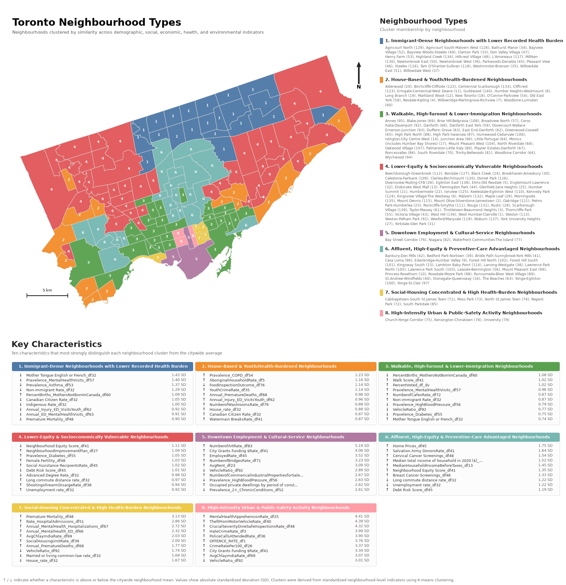
Figure 6. The map assigns each of Toronto’s 140 historical neighbourhoods to one of eight K-means clusters based on its overall pattern across all 103 indicators. The map colours correspond to the cluster numbers shown in the legend: neighbourhoods with the same colour belong to the same cluster and therefore have relatively similar overall profiles.
The accompanying cluster cards show the ten variables that most strongly distinguish each cluster from the Toronto neighbourhood average. Values are expressed in standard deviations (SD): 0 SD represents the average across neighbourhoods, +1 SD means the cluster average is one standard deviation above the neighbourhood average, and −1 SD means it is one standard deviation below it. Up arrows indicate variables that are higher than the Toronto neighbourhood average for that cluster, while down arrows indicate variables that are lower. Larger absolute SD values indicate characteristics that more strongly distinguish that cluster.
The cluster colours and numbers are identifiers rather than rankings: Cluster 8 is not inherently better or worse than Cluster 1. Likewise, neighbourhoods within a cluster are similar across the complete 103 variable profile but are not identical.
The legend on the right displays themes observed within each cluster. Neighbourhoods that fall within that cluster are displayed under the titles.
Cluster 1: Immigrant-Dense Neighbourhoods with Lower Recorded Health Burden
The most distinctive features of Cluster 1 are demographic.
Compared with Toronto neighbourhoods overall, this group has:
- substantially lower English/French mother-tongue share,
- substantially lower non-immigrant share,
- lower Canadian citizenship rate, and
- a higher percentage of births to mothers born outside Canada.
Several recorded health and healthcare indicators are also lower than average, including asthma prevalence, mental health related primary care visits, youth injury emergency department visits, mental health ED visits and premature mortality.
These are neighbourhoods with larger immigrant and newcomer populations that also tend to show lower recorded levels of several health problems and healthcare use measures.
Cluster 2: House-Based & Youth/Health-Burdened Neighbourhoods
Cluster 2 is characterized by a relatively house oriented residential pattern together with elevated youth- and health- related measures.
Its defining characteristics include:
- higher house dwelling share,
- higher Canadian citizenship share,
- higher COPD prevalence,
- higher youth crime rate,
- higher youth injury related emergency department visits, and
- higher premature death measures
The youth indicators require a specific caveat: they show that youth related outcomes are elevated, not necessarily that these neighbourhoods contain a larger proportion of young people.
Cluster 3: Walkable, High-Turnout & Lower-Immigration Neighbourhoods
Cluster 3 stands out for:
- high Walk Score,
- high 2022 voter turnout,
- relatively high non-immigrant share,
- relatively high English/French motherntongue share,
- fewer births to mothers born outside Canada,
- lower vehicle availability, and
- lower prevalence of several cardiometabolic health measures.
This profile combines urban form, civic participation and demographic composition. In other words, these are more walkable, lower car neighbourhoods with higher voter turnout, a larger share of non immigrant and English/French-speaking residents, and generally lower levels of several cardiometabolic health conditions.
Cluster 4: Lower-Equity & Socioeconomically Vulnerable Neighbourhoods
Cluster 4 shows one of the clearest socioeconomic vulnerability profiles.
Its strongest deviations include:
- a lower neighbourhood equity score,
- a higher prevalence of Neighbourhood Improvement Area designation,
- higher social assistance use,
- higher unemployment,
- lower advanced degree share,
- longer commutes,
- higher diabetes prevalence,
- higher fertility, and
- elevated firearm discharge activity.
These are neighbourhoods facing greater socioeconomic disadvantage, where unemployment, social assistance use, longer commutes, and lower education levels tend to occur alongside poorer health and more serious public safety challenges.
Cluster 5: Downtown Employment & Cultural-Service Neighbourhoods
Cluster 5 has an unusually high employment, cultural, and service profile.
Its strongest characteristics include:
- extremely high public art density,
- high City grant funding per resident,
- very high employment per resident,
- more bridges per resident,
- high average rent,
- low vehicle availability,
- elevated commercial/industrial property activity,
- a high share of recently constructed dwellings, and
- relatively low prevalence of several chronic-health indicators.
These are dense, high-activity urban neighbourhoods with lots of jobs, cultural amenities, public investment, newer development and expensive housing, where residents tend to rely less on cars.
However, this cluster illustrates an important issue in central Toronto.
A downtown neighbourhood can contain relatively few permanent residents while supporting enormous numbers of workers, visitors, businesses and services. Dividing those activities to calculate rates by resident population (as done in the preprocessing) can therefore produce very high per resident values.
Those measures are not necessarily errors, they describe the intensity of activity relative to the number of people who live inside the boundary. But they should not be interpreted as if only residents use those services or spaces.
Cluster 6: Affluent, High-Equity & Preventive-Care Advantaged Neighbourhoods
Cluster 6 is the clearest high socioeconomic advantage profile.
It is distinguished by:
- higher home prices;
- higher household income;
- higher neighbourhood equity score;
- higher cervical-cancer screening;
- higher breast-cancer screening;
- lower unemployment; and
- shorter long-distance commuting.
These are more affluent and advantaged neighbourhoods, where higher incomes and home values tend to occur alongside lower unemployment and higher use of preventive health services.
Cluster 7: Social-Housing Concentrated & High Health-Burden Neighbourhoods
Cluster 7 shows a strong combination of social housing concentration and acute health burden.
Its strongest distinguishing characteristics include:
- substantially elevated premature mortality,
- high hospital admission rates,
- elevated mental health hospitalizations,
- elevated mental health emergency department use,
- higher recorded chlamydia rate,
- substantially more social housing units per population,
- lower vehicle availability,
- lower married/common-law share, and
- much lower house-dwelling share.
This is one of the clearest examples of multiple social and health indicators clustering geographically. In other words, higher hospital use, mental health emergencies, premature mortality, and other health challenges tend to occur alongside more social housing, lower car access, and less house based residential structure.
Cluster 8: High-Intensity Urban & Public-Safety Activity Neighbourhoods
Cluster 8 is distinguished by exceptionally high levels of several urban activity and public safety indicators.
These include:
- mental health apprehensions,
- theft from motor vehicles,
- DineSafe inspection activity,
- recorded hate crime rate,
- police calls attended,
- overall offence rate,
- another broad crime rate measure,
- City grant funding,
- recorded chlamydia rate, and
- very low vehicle availability.
These are highly active urban neighbourhoods where police, public-safety, inspection, and health-related activity are unusually concentrated. Importantly, the strongest interpretation is not simply “high crime.”
As with Cluster 5, resident population may be relatively small compared with the number of people who work in, visit, or travel through these neighbourhoods.
Part 9. What the analysis does and does not show
The main finding of this project is not any single correlation or cluster. It is that Toronto neighbourhood characteristics are deeply interconnected.
Income, housing, immigration, health, transportation, infrastructure, public safety, and civic participation often vary together. This means that simple one variable explanations can be misleading. For example, a relationship between voter turnout and immigration may also reflect differences in citizenship, income, education, housing, or mobility.
The correlation analysis shows which characteristics tend to rise and fall together across neighbourhoods. The hierarchical clustering shows which variables share similar geographic patterns, while the K-means analysis shows which neighbourhoods have similar overall profiles across all 103 indicators.
None of these analyses establish cause and effect. A strong relationship between two variables does not mean that one causes the other, and the neighbourhood clusters should not be interpreted as fixed or definitive categories.
The results also apply to neighbourhoods, not individual people. A neighbourhood level relationship cannot automatically be used to describe the behaviour or characteristics of the individuals who live there. Recorded measures such as crime, healthcare use, or disease rates can also be influenced by factors such as service availability, reporting, policing, population composition, and the number of people who work in or visit an area.
Finally, the datasets come from different years and sources, and some indicators share common denominators or measure related concepts. These factors may contribute to some of the patterns observed.
The analysis is therefore best understood as a map of associations: it shows which characteristics tend to occur together, how broader neighbourhood patterns are structured, and where more focused questions may be worth exploring.
A future empirical question is not simply “What is correlated with what?” but “Why do these patterns appear, and do they remain when we control for other factors or analyze the data in different ways?”
Part 10. Limitations
1. Some neighbourhood 158 to 140 aggregations are approximate
Some datasets use the newer neighbourhood 158 classifications, so mapping it to the 140 neighbourhood classficiation requires combining measures for some neighbourhoods. This was done using a simple mean for some of these neighbourhood profile variables. For many rates, a denominator weighted reconstruction would be more exact.
2. The datasets come from different time periods
This project is not a single year snapshot.
It combines election, Census/neighbourhood profile, health, public safety, infrastructure and other datasets collected over different years.
The analysis therefore assumes that enough of the relative geographic structure persists across time to make exploratory comparison useful. That assumption will be stronger for slowly changing characteristics than for rapidly changing outcomes.
3. Boundary-crossing voting subdivisions are assigned to one neighbourhood
A voting subdivision that overlaps two neighbourhoods is assigned entirely to whichever neighbourhood contains the largest share of its area.
This introduces some measurement error around neighbourhood boundaries.
4. Missing data are median-imputed for K-means
Median imputation keeps all neighbourhoods in the clustering model, but missing observations are pushed toward the centre of the distribution.
A future technical appendix could include a missingness table so readers can see which indicators rely most heavily on imputation.
5. Correlated domains can receive disproportionate weight in K-means
Every standardized variable receives one dimension in the Euclidean distance calculation.
That means a domain represented by many correlated variables such as health can collectively influence distance more strongly than a domain represented by only one or two measures.
Possible future approaches include dimensionality reduction within conceptual domains, factor analysis or explicit domain weighting.
7. Many variables share the same population denominator
Different count variables are often divided by the same population estimate.
This can introduce correlation structure associated with a shared denominator in addition to the underlying relationships among the events being measured.
8. Spatial autocorrelation is not explicitly modelled
Neighbourhoods are not independent observations randomly scattered across space.
Nearby neighbourhoods can share housing stock, transit access, demographics, infrastructure and services.
The standard Pearson p-values and FDR procedure do not explicitly account for spatial dependence, so the apparent statistical evidence may be stronger than it would be under a spatial model.
9. Neighbourhood relationships are not individual-level relationships
This is the ecological fallacy problem.
If neighbourhoods with a high value on one demographic variable also have lower turnout, that does not establish that individuals belonging to that demographic group are less likely to vote.
The same caution applies to health, crime, social assistance and every other aggregate relationship in the analysis.
10. Eight K-means clusters are a descriptive summary, not ground truth
K-means will produce a partition whenever it is asked to do so.
The eight cluster solution is useful because it compresses a high-dimensional dataset into an interpretable map, but neighbourhoods exist on a continuum.
A neighbourhood near a cluster boundary may resemble neighbourhoods in another cluster almost as much as those in its assigned group.
11. Cluster names are interpretations
Neither hierarchical clustering nor K-means generates semantic names.
The statistical output consists of variable or neighbourhood memberships. Names such as “socioeconomically vulnerable,” “downtown employment” or “preventive care advantaged” are concise interpretations of the variables that most strongly distinguish each group.
They should be read as descriptions, not as formal classifications supplied by the algorithms themselves.
12. Correlations are bivariate
The correlations do not control for other neighbourhood characteristics. A relationship between two variables may weaken, disappear, or reverse after accounting for related demographic, socioeconomic or geographic factors.
Part 11. Conclusion
Toronto does not reduce neatly to a few completely separate kinds of neighbourhood.
What the data does reveal is a dense web of relationships among demographics, socioeconomic conditions, health, urban form, mobility, infrastructure, services, civic participation and public-safety activity.
The correlation matrix shows those relationships variable by variable.
The dendrogram (see Part 5) compresses the 103 indicators into 17 broader groups with similar geographic patterns.
The K-means map provides an eight profile summary of how neighbourhoods resemble one another across the full high dimensional dataset.
Full preprocessed dataset, analysis code, and data dictionary used is available here: https://github.com/epheva/toronto-neighbourhood-correlations